User Customizeable Data Grid
Updated August 11, 2021
In numerous places within Eclipse, information will be presented to the user in "Data Grids". These areas display in a grid style format. Depending on their access level, users can customize many of these grids.
General Comments:
-
Eclipse includes a feature that will allow the user to reset all list box displays to default settings. This feature will be useful, for example, if the user finds the default displays unacceptable for some reason.
-
The user may customize specific list box displays while retaining the default settings for other displays.
-
The options selected for the displays will be user specific, this means that individual users will be able to decide which data they would like to see in the list box and how they would like that data displayed.
Data Grid Options
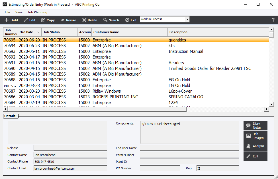
Choose almost any grid, the Estimating/Order Entry display screen will be used as an example.

To access custom data grid features, right-click any column heading on the screen and the system will display selections Ascending, Arrange Columns, Reset Default View, and Options. An arrow ![]() following a column heading label indicates that the data has been sorted, either ascending or descending, based on that columns data.
following a column heading label indicates that the data has been sorted, either ascending or descending, based on that columns data.

-
Ascending/Descending
Select Ascending/Descending and the data grid (for the column selected) will be displayed in ascending or descending order.
-
Arrange Columns
Select Arrange Columns, then use the mouse to move columns as desired. When finished, de-select the "Arrange Columns" option.
The user will note that the width of any column may be increased or decreased simply by placing the cursor at a field boundary. When the cursor turns to a double-headed arrow, select the boundary and drag it either left or right. This feature will always be available regardless of the setting of the "Arrange Columns" option.
-
Reset Default View
Select option Reset Default View and the data grid display will be displayed as pre-programmed by EPMS. This will apply to the current display only and will not globally reset all displays in the system. Reset globally using Options.
-
Options
The Options menu selection will allow a user to customize the fields displayed in the data grid. Select Options and the system will display View, Data Export and Columns tabs. Functions available on these screens will be self-explanatory, except where noted.
View Tab
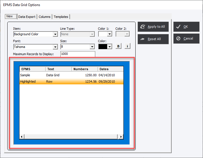
The settings on the View tab allow the user to customize basic appearance values for the select grid. The section at the bottom of the Options screen shows the way the final grid appearance will look.

Item
There 3 choices;
Background Color - This is the background color of all the items in the Data grid.
Highlight color - Is the color the select line or lines will appear.
GridLines - Are the lines between rows.
Each item can have;
|
Value |
Background Color |
Highlight Color |
GridLines |
|
Line Type |
N/A |
N/A |
4 choices; None, Single, Raised or Sunken |
|
Color 1 |
Color of Background |
Background Color of selected row(s) |
Only available when Single is chosen |
|
Color 2 |
N/A |
Font Color of selected row(s). It can be different than base color value |
N/A |
|
Font |
Based on Windows Fonts |
Will change overall base font |
Will change overall base font |
|
Size |
6-24pt |
Will change overall base size |
Will change overall base size |
|
Color |
Font Color |
Will change overall base color |
Will change overall base color |
|
Bold |
Bold |
Will change overall font |
Will change overall font |
|
Italic |
Italic |
Will change overall font |
Will change overall font |
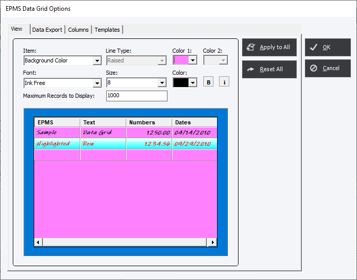
Below is an example with changes;

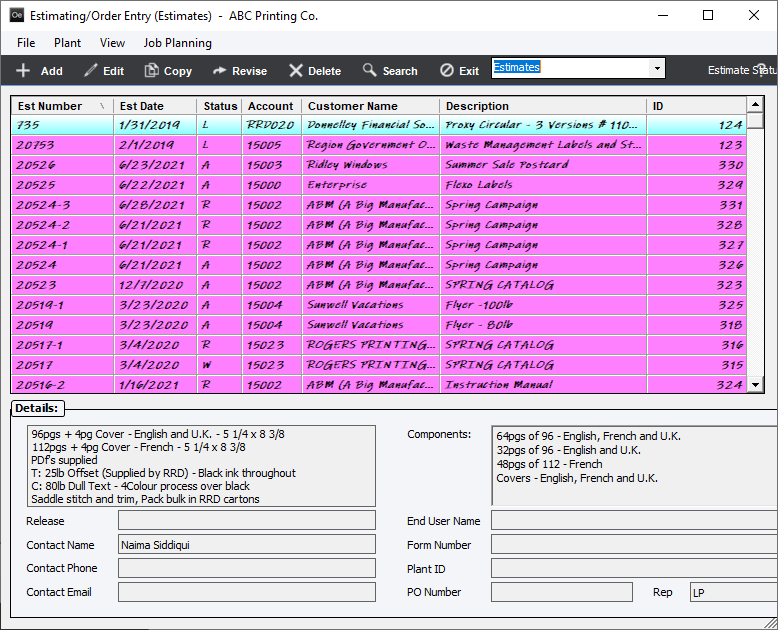
Which would appear in the actual grid as;

Apply to All button
After setting formatting options for a specific display of data, the user may set all customized displays to the same values by clicking the Apply to All button. Otherwise, the revised display selections will only apply to the current display. In the above example only Estimating would display with this appearance. Work In Process, Completed, etc would remain as their default or customization.
Reset All button
The user may also globally reset all displays to default values by clicking the Reset All button.